A bilingual cabin plan: information design for İstanbul Airlines
In Istanbul Airlines' Turkish and English cabin illustrations, methods to compare seats, lounges, and alternative seating arrangements without confusion.
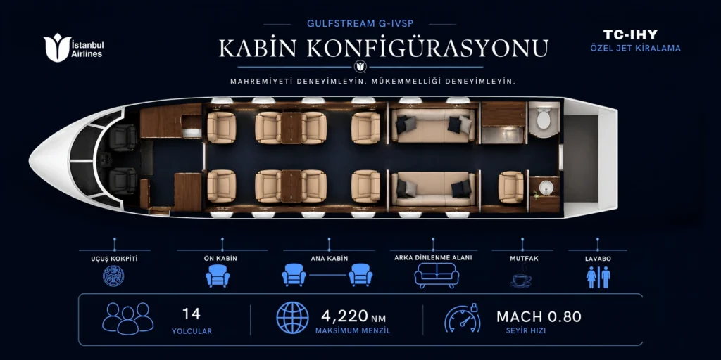
In a bilingual cabin plan, the drawing serves as a fixed reference point for the reader. When transitioning from Turkish to English, there should be no need to search for the seat from scratch. Therefore, the direction, scale, and area sequence of the text to be translated must be considered separately.
Keep the layout consistent when switching languages
The Istanbul Airlines selection features a Turkish cabin configuration, an English explanatory layout, and an alternative Turkish arrangement. At first glance, these are three similar panels. Comparing the first two raises the question of how the same section is named in both languages. In the alternative layout, the question shifts: has something actually moved inside the aircraft? If the title does not make this distinction, readers might mistake the translation for a second cabin model.
Keep the plan in place when a label runs long
An expression fitting on one line in one language may require two lines in another. Instead of cramming both languages into the same box, allocate space in the description field. Then place the two outputs side by side and find the same resting area with your finger. If your finger moves to a different spot, the issue is visual mismatch before translation.
This piece is a promotional and layout presentation; not an aviation safety card. Three cabin illustrations and printed promotional set for Istanbul Airlines. can be examined with these two reading goals in mind.
Related projectİstanbul Airlines ↗