The Puro Club Ankara logo: how cigar ash shaped the lettering
The cracks in cigar ash became part of the lettering in my winning entry for Puro Club Ankara’s 2025 logo competition. How much texture can a letter hold and still read clearly from a distance?
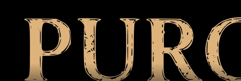
For the Puro Club Ankara logo, I looked closely at the surface of cigar ash. Its irregular marks gave the letters their texture. From a distance you read the name. Up close you can see where the design began.
Where does the texture sit in a letter?
Look closely at the P, U and R. The dark marks stop and start inside each gold letter. The outline makes the letter recognisable, while the marks give it character. A stroke that closes the opening of the U or obscures the leg of the R makes the name harder to read.
Look at the logo at two sizes
First shrink the logo until the name is just large enough to read. Then zoom in until a single letter fills the screen. If you have to decipher the small version, the texture is too strong. If every mark looks alike in the close-up, the ash has lost its particular rhythm.
This logo won first prize in Puro Club Ankara’s 2025 design competition. See the original logo, a detail of the lettering and the competition certificate in Award-winning Work.
Related projectPuro Club Ankara ↗