How to test a logo at small sizes
Test the same logo at three actual usage sizes: for a tag, a profile picture, and a print on a shopping bag.
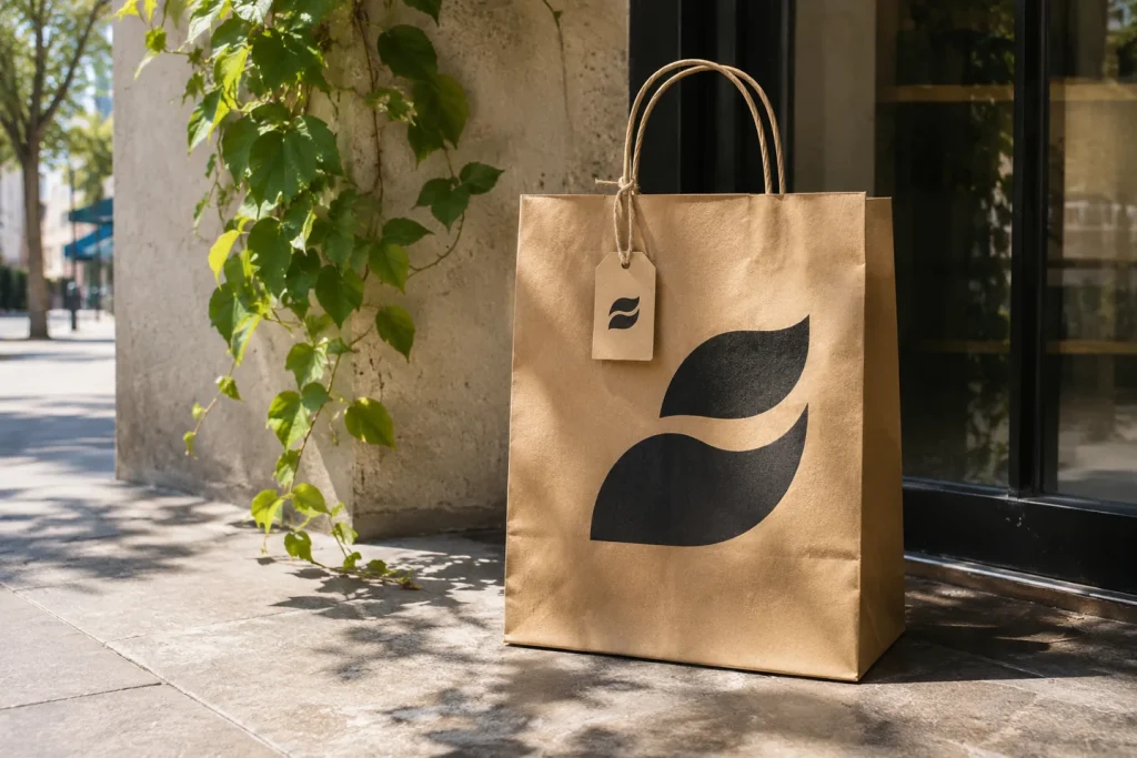
The largest visual in a logo presentation is usually the easiest test. The real question is whether the mark remains recognizable on a small product tag or within the circular frame of a social media profile picture. Focusing solely on the high-resolution master file when receiving a logo design from a freelancer can obscure these practical limitations.
Conduct three separate tests.
Print the logo at the actual size of the tag. If fine lines begin to merge, try increasing the spacing. Next, view the logo within the circular frame used for profile pictures at a standard screen size; an icon positioned near the corners of a square file might get cropped out by a circular mask. Finally, display the mark in a single color. If two elements are distinguished only by color, their silhouette may change when printed in a single color.
Document your findings on a single page. For instance, you might use the full name on a shopping bag but a shortened version of the mark on a small tag. In such cases, the delivered files should clearly indicate the intended use for each version. Rather than applying a universal "minimum size" rule that fits every brand, base your requirements on your specific logo’s letter spacing and the intended production method—as the limitations for fine embroidery differ from those for high-quality paper printing.