When does grey type disappear on a cream background?
Set the same line of a menu in two greys and measure the difference before changing the type size.
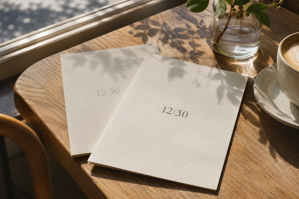
You open a café menu on your phone. The name of the dish is perfectly clear, but you bring the screen closer to read when the kitchen closes. Sometimes the letters are too thin. Sometimes the designer has picked a grey that sits just a little too close to the cream behind it.
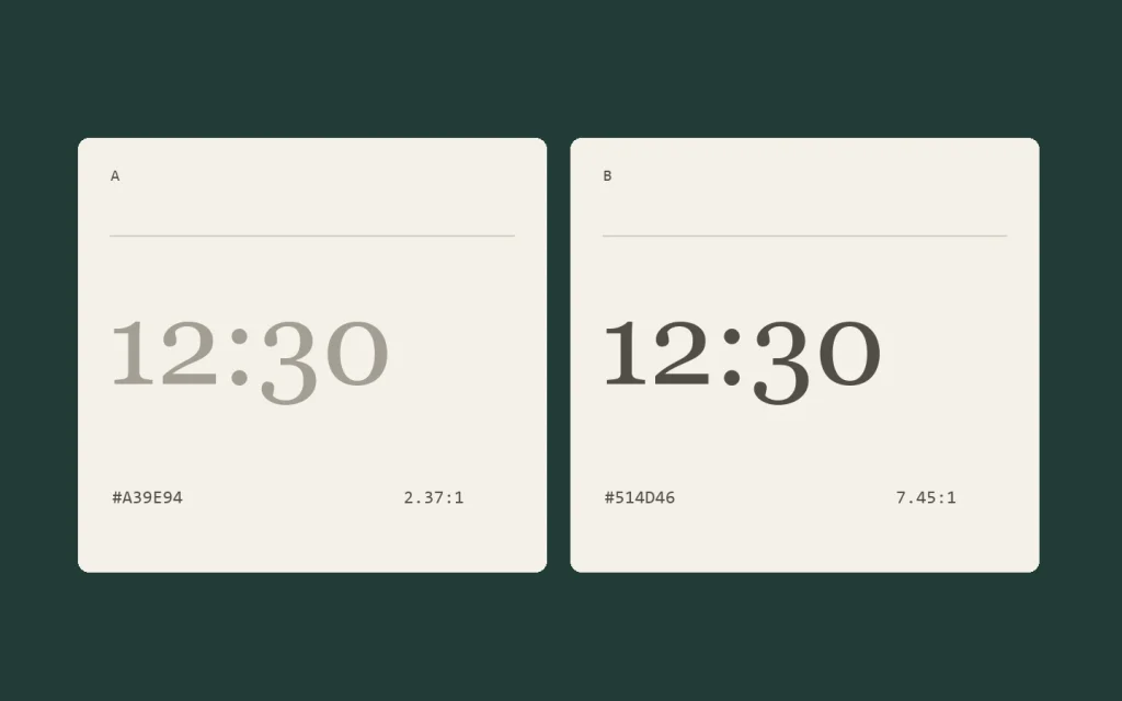
One time, two ink colours
The two cards in the illustration use the same type size and the same #F5F1E8 background. Compare #A39E94 on the left with #514D46 on the right. Their contrast ratios are about 2.37:1 and 7.45:1 respectively. WCAG AA sets a minimum of 4.5:1 for regular text and 3:1 for large text on the web. For a printed menu, check the stock under the light in which guests will read it.
Which lines need the extra contrast?
Start with information a guest actually needs to act on, such as serving times, prices and allergens. If you make the secondary text both smaller and lighter, you lose track of which change made it difficult to read. Change the colour alone for the first proof. Then open the page at its real size on a phone. For a terrace menu in Northern Cyprus, try reading it at lunchtime in daylight.