Why a brand’s orange changes in print: spot ink or CMYK?
How can you compare sample when deciding between specialty ink and four-colour printing in a packaging proposal?
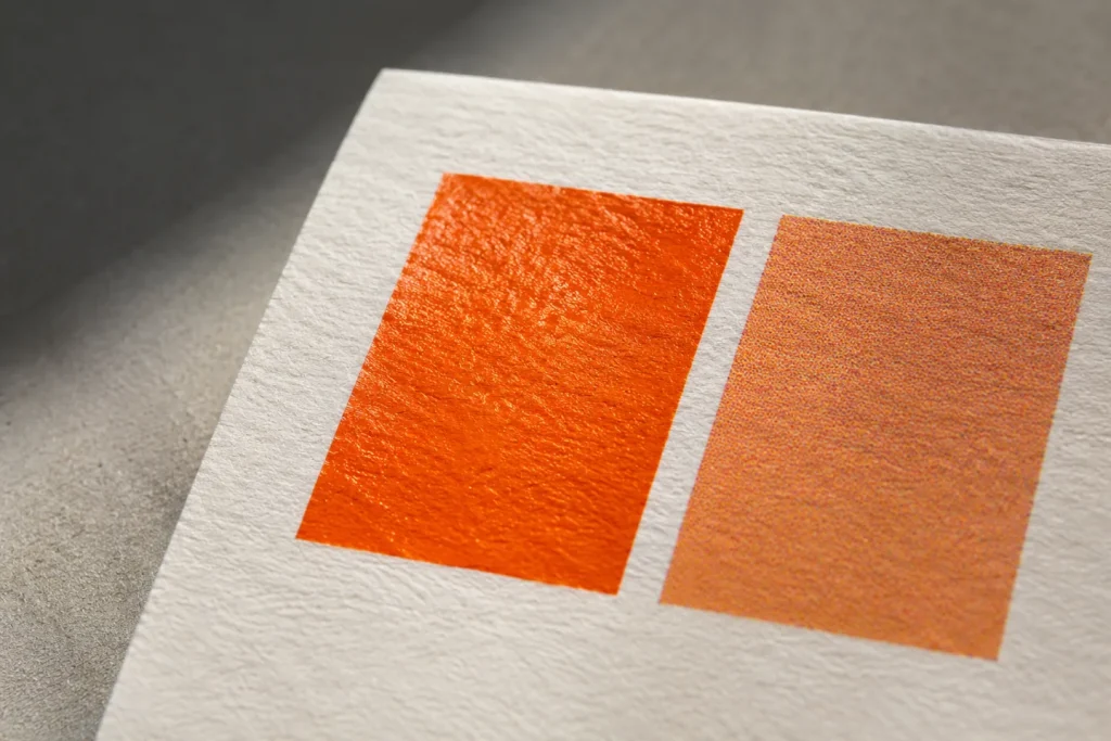
The bright orange you choose from the screen may look more subdued on cardboard. First separate the two production decisions. In CMYK printing, orange emerges from the combination of basic printing colors. In spot printing, a separate ink is used for this area. Writing “spot” alone does not describe the look you want. The color and surface of the paper also contribute to the result.
Open the sample at the place of use
Imagine you receive an offer for a beverage label. Ask the printer for two samples on the planned material: his recommended CMYK equivalent and, if possible, a special ink print. Evaluate the two first side by side, then place the product at its distance on the shelf. The difference, which seems striking when viewed side by side, may be insignificant in the small logo. The opposite may happen in packaging with a large orange surface.
Record the stock, printing process and approved physical sample in the design file. On the next order you can refer to the same sample instead of asking for last time’s orange. Ask the printer to price the extra ink and explain the production requirements. Two on-screen swatches cannot tell you what the job will cost.