Corner Pub: from the windows to the table
A pub's identity meets the facade, blends into the glass, and becomes a printed piece on the table.
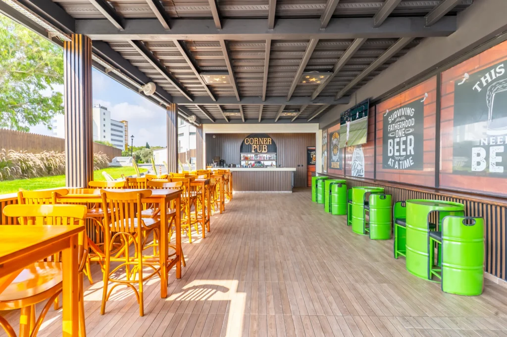
On Corner Pub's sea-facing facade, the name is read in white letters. Upon entering, the venue's identity is not conveyed through a single sign. Letters, graphics spreading across glass surfaces, and the brand mark on the service are visible from different distances.
Lettering on glass
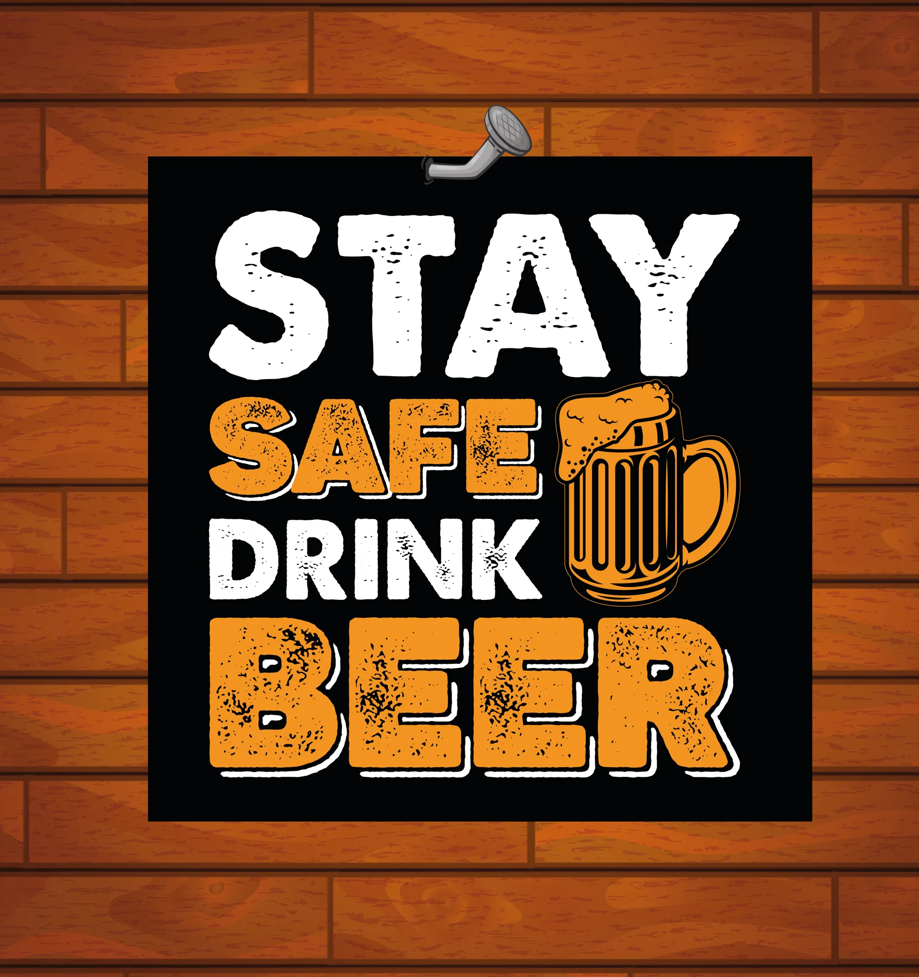
In the production file for the 'Stay Safe Drink Beer' graphic, text sits on a wood texture using black and yellow tones. In the venue photo, light, ceiling beams, and table lines are added around the composition. Comparing the flat file with its in-situ appearance demonstrates why considering the graphic on glass independently of its surroundings is difficult.
A closer look at the table
In the American service at 42 × 30 cm, large text gives way to green marble texture and the Corner Pub emblem. The QR menu on the table is viewed up close. In these two pieces created for the same venue, there is no need to find direction or attract attention from afar; identity becomes part of the usage.
Corner Pub's brand identity and applications were developed with the Design Studio team. The project features exterior facade, interior space, and print designs.