Adobe MAX 2026 for designers: taking an exhibition poster from Photoshop to print
Explore Photoshop Relight, Illustrator 31.0 blends and InDesign 22.0 layouts through one exhibition poster, from the first lighting choice to the final print check.
Cem Yaşlı
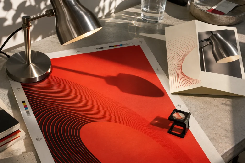
The curator approves the photograph for an exhibition poster, then sends two changes. The doors will open half an hour earlier, and the venue needs a vertical announcement for phones alongside its printed poster. Is the time correct in every file? On a phone, does the headline overlap the bright side of the lamp? Can the printer still edit the vector lines? These are the questions behind our look at the updates Adobe announced on 10 November 2026.
In our example, we will use a photograph of a single desk lamp, a linear motif derived from two curves, and a short event schedule. There are three outputs: a 50 × 70 cm poster, a folded A5 schedule, and a 1080 × 1920 pixel announcement. The following application is based on Adobe's release documentation and is a replicable work with your own files. Since time and performance values vary from computer to computer, the benchmark is the errors remaining in the delivery after revision.
Photoshop Relight: where does the second light fall?
Shiny metal is a good material for evaluating lighting. An intervention that looks soft on matte paper will appear as a streak on brushed steel. Photoshop's Relight tool lets you change the position, color, and brightness of the light added to the scene afterward. If you play with all three settings at once, it becomes difficult to understand which one improves the image. First, change only the position. Observe how the shiny streak on the cylindrical head of the lamp accentuates the curve of the body.
Prepare two images for comparison. In the first, the light should come from near the title of the poster, and in the second, from the opposite direction. In a small page preview, note where the first glance goes. Then, look at the edge of the table, the cable, and where the base of the lamp touches the floor in actual pixel size. If the product appears more bulky while the shadow of the cable points in a completely different direction, the decision is still incomplete. Warming the color of the light can also make the metal surface look like brass. If the product's material is specified in the brief, keep the first image open as a material reference.
Removing an object means dealing with its shadow
The Remove Tool update can now account for traces like shadows or reflections associated with the removed object. Try lifting a pen from the table. It's easy to notice if the pen body has disappeared. It's harder to discern whether a subtle reflection on the varnished tabletop has vanished, or if the edge of the paper is warped in that area. If the pen is cutting into the lamp's shadow, these two shadows belong to different objects. Cleaning both might make the lamp appear to float on the table.
The new Quick Compare compares the before and after views on the canvas using a divider. Pass the divider directly over the defect. On the first pass, look only at the contour; on the second, the direction of the paper fibers; and on the third, the shadow intensity. Just because the defect isn't visible when the poster is reduced doesn't mean it will be hidden when enlarged on the same photo program cover. Select the most enlarged submission for verification. Adobe's Mockups feature, also introduced in beta, makes this difference visible by submitting a presentation image prepared to illustrate the placement on a surface, along with a flat, measured drawing that the printer will use.
Illustrator 31.0: shaping the space between two curves
Thinking of Blend simply as a color gradient misses the tool's most useful aspect. When intermediate lines are created between two open curves, the eye actually reads the white spaces between those lines. In the November release, you can adjust the transition with the handles on the canvas and view the result along with the Blend panel. On the exhibition poster, draw the first curve parallel to the lamp body and the last one near the bottom edge of the paper. The distribution between the two ends determines where the motif becomes denser and where it breathes.
In the first example, use 12 intermediate steps. In the second example, keep the same endpoints and the same number of steps, only changing the distribution. In the third, keep the distribution of the second example and increase the number of steps to 24. This way you can distinguish which decision resulted in the "denser" appearance. Compare each example at banner width and the actual width you will use on the program cover. A spacing that looks elegant on screen may turn into a dark smudge in small print. When requesting a proof, send a piece containing the densest section at 100% scale.
There's a practical reason to keep the Live Blend object in the master sketch. Instead of moving dozens of paths individually when you get a comment like "The lines are too close to the date on the right," you can correct a single end curve. If the manufacturer requests a specific delivery format, prepare a separate copy for that delivery. The AI Assistant, which can handle tasks like layer editing in the same release, is listed in beta. Checking which layers to keep open for print proofing, using names like spot color, cutting line, and invisible guide, is still part of the process.
InDesign 22.0: what happens when the headline gets longer?
Place the heading “Opening” in the A5 program. Below it, show the time and venue, and below that, a two-line description. Now change the heading to “Exhibition opening and interviews with artists.” In a fixed-height text box, the last words may overflow. If you manually enlarge the frame, you will need to push the time or the image below it. Flex Layout's new behavior allows text frames to resize and sub-elements to shift accordingly as the content changes.
There needs to be space on the page for a box to grow. Produce three separate proofs: a short title, a long title, and a two-line venue name. Check that the time remains with the event name, that the lines for two different events don't overlap, and that the sponsor area at the bottom doesn't overflow. If the file will be bilingual, add the second text to the first draft. When the title, which is one line in Turkish, becomes two lines in German, the auto-layout limit will appear much earlier. An incorrect match between the time and the event in the event program is a more serious error than a small difference in spacing.
When to use Check Document and when to run Preflight
InDesign's Check Document panel allows you to examine language, consistency, and accessibility issues within the document. Include two visuals in the program: one meaningful, the other purely decorative. If the first is a floor plan, the alternative text "drawing with gray lines" provides little information to the reader. Describing the positional relationship between the entrance and the living room is more helpful. Writing a lengthy description for a decorative motif might delay hearing information about the next event. Consider the function of the element on the page when deciding on an automatic suggestion.
The same file also contains mechanical production controls. For files with missing images, overflowing text, or outside the target print profile, run the Preflight profile requested by the printer separately. Accepting the language suggestion in Check Document does not prove that the address or time is actually correct. Compare the opening information with the approved program. The release notes also include page or form-specific export from the Pages panel. This is only useful when sending a changed page for review. Upon final file delivery, open the multi-page PDF from beginning to end and recheck the page count.
Which update is worth trying first?
In a photography-heavy freelance graphic design job, cleaning up an object and examining its boundaries with Quick Compare is a short and measurable starting point. For a studio that creates visual identity, the Blend experiment might be more illustrative. And in a publication where twelve separate events are translated into different languages, if the main effort is focused on redesigning the layout rather than improving the photograph, then doing the initial pilot in InDesign makes sense.
Choose a single last-minute change for the rehearsal: “Opening time 7:00 PM instead of 6:30 PM, and the venue name is two words longer.” Export the poster again, program, and phone announcement to the folder. Write down on a piece of paper which file you reopened, which boxes you manually edited, and what you checked in the final PDF. This is often where you understand the true impact of the new feature. You'll know how many decisions you still have to make when the same change comes up again on the next project.
Sources
Adobe MAX · Announcement November 10, 2026
Photoshop Desktop Version Notes