White balance: why the same fabric looks different in two product photos
When should you capture—or refresh—a gray reference frame during a product shoot?
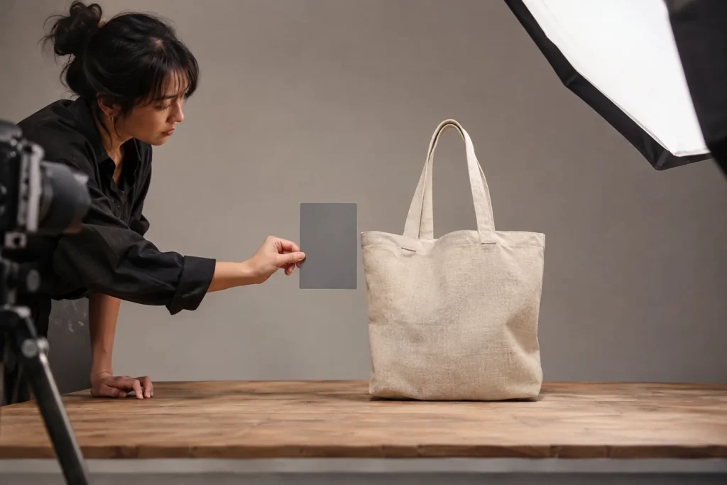
The front of a linen bag might appear cream-colored, while a close-up shot of the same item looks pinkish. Since the product itself hasn’t changed, it might be tempting to simply correct each frame by eye—but first, examine the shooting conditions. If daylight coming through a window is mixed with the warm light of a ceiling lamp, the image may contain different light tones across its various parts.
Place the reference card where the product is positioned.
Do not place the neutral gray card near the camera; instead, position it where it will receive the exact same light as the product. Capture a reference frame before beginning the series. If the direction of the light, the position of a curtain, or the lighting source changes, capture a new reference frame. Then, apply the same initial white balance setting to all frames shot under those conditions, and compare the shadowed and highlighted areas of the fabric. A single measurement cannot always balance two different light sources.
When preparing graphic designs for online sales, the goal is not necessarily to make every background pure white. As you brighten the white background, ask yourself whether you are inadvertently erasing the actual color of a cream-colored product. Review the corrected series as a collection of thumbnails placed side-by-side. If one frame stands out as inconsistent with the others, first revisit the reference frame—only then should you consider applying a separate, specific color correction.